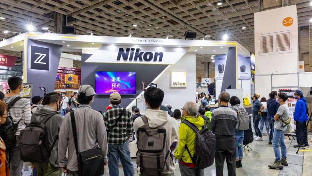
Trade shows are loud in every sense: bright aisles, competing messages, and a steady flow of people making split-second decisions about where to stop. In that environment, “being seen” isn’t about shouting the most—it’s about creating a booth that reads clearly from a distance and still rewards a closer look. Lightboxes are one of the most reliable tools for doing exactly that, because they turn your graphics into illuminated landmarks.
The trick is using them with intent. A lightbox isn’t automatically high-impact; it becomes high-impact when it supports a strong layout, a focused message, and a visitor journey that makes sense.
Start With the Job Your Booth Must Do
Before you choose shapes, sizes, or lighting temperatures, get specific about outcomes. Are you trying to:
-
Book demos?
-
Capture leads for follow-up?
-
Launch a new product line?
-
Reposition your brand in a crowded category?
Each goal changes what “impact” means. A demo-driven booth needs clear wayfinding and space management. A brand-launch booth needs bold visual hierarchy and a single, memorable idea. When you know your priority, lightboxes become a design system, not decoration.
Define one message that works at 10 metres
If attendees only remember one thing, what should it be? That one thing needs to be readable fast. Lightboxes help, but they can’t rescue clutter. Keep your primary headline short, benefit-led, and legible from afar. Think five to seven words, max, with high contrast and generous spacing.
Use Lightboxes to Build a Visual Hierarchy (Not a Wall of Light)
A common mistake is to over-light everything. When everything glows, nothing stands out. Instead, treat lightboxes as “anchors” that guide attention: first from the aisle, then into the booth, then toward a conversion point (demo, conversation, scan, or signup).
Choose placements based on sightlines
Walk the floor in your head. Most attendees approach at an angle, not straight on. Consider these placements:
-
A tall backwall lightbox for brand recognition and the primary message.
-
A perpendicular “blade” or tower element to catch people moving down the aisle.
-
A counter-level lightbox or small illuminated panel near the interaction point, reinforcing the call to action.
If you’re planning your build and want a sense of what’s possible across formats (walls, counters, hanging signs, modular frames), it’s worth reviewing examples of LED lightboxes for exhibitions to understand how different configurations affect visibility and footprint.
Balance brightness with breathing room
Light attracts the eye, but negative space holds it. Give your illuminated elements room to “land” visually. That might mean fewer messages, larger margins, or even a deliberately darker adjacent area to increase contrast.
Design Graphics for Illumination, Not for Print
Backlit graphics behave differently than posters. Colours can shift, gradients can band, and fine detail can disappear. The best lightbox designs are simpler—and that’s a good thing.
Practical design rules that prevent expensive reprints
Use these guidelines to avoid common pitfalls:
-
Increase line weights and font sizes compared to print layouts.
-
Avoid tiny text blocks; if it must be read, it must be close—and most people won’t get close unless you’ve already earned their interest.
-
Be careful with large dark areas; they can look muddy when backlit unless the files are built properly.
-
Prioritise high-res imagery (and verify the final viewing distance). Pixelation looks worse when illuminated.
If your booth includes product photos, test how they look under backlighting. Reflective surfaces, glass, and metallic finishes can behave unpredictably when lit from behind.
Keep the message stack tight
Think in layers:
-
Brand + one big benefit (seen from the aisle)
-
Proof or differentiation (seen from 2–3 metres)
-
Details (only where people naturally pause)
Lightboxes can support each layer, but don’t force every layer onto the same panel.
Shape the Visitor Journey With Light and Layout
A high-impact booth doesn’t just look good—it moves people. Lightboxes can act like visual signposts, subtly directing visitors where to stand, what to touch, and who to talk to.
Create a “stop point” and a “next step”
Ask yourself: where do people physically stop? That’s where your strongest illuminated message should be. Then decide the next step—demo screen, sample station, meeting table, lead capture—and light that area with a secondary element.
A simple approach that works well is a triangle:
-
Primary lightbox (attraction)
-
Engagement zone (demo or conversation)
-
Conversion point (scan badge, book meeting, take-away)
When those three points are clear, staff don’t have to chase. Visitors self-navigate.
Get the Operational Details Right (So the Booth Performs All Day)
Trade shows are long. Lighting and structure need to hold up through hours of use, quick cleans, and sometimes less-than-perfect venue conditions.
Power, glare, and comfort matter more than you think
Overly bright panels can create harsh glare in photos and make the booth feel clinical. Under-lit booths, meanwhile, vanish in busy halls. Aim for comfortable brightness and consistent colour temperature across panels so your brand colours don’t look different from one side to the other.
Also consider where the light goes. If a panel throws glare onto a demo screen, people will drift away rather than squint.
One checklist to reduce last-minute stress
Here’s a practical pre-show run-through (keep it short, keep it actionable):
-
Confirm power access, cable routing, and backup adapters
-
Test graphics under illumination (not just on a monitor)
-
Check sightlines from the aisle at different approach angles
-
Photograph the booth mock-up to spot clutter you missed
-
Plan a quick “reset routine” staff can do every hour (wipe counters, straighten literature, clear bags)
Make the Booth Feel Like a Brand, Not Just a Structure
Lightboxes do best when they support a coherent brand environment. That means consistent typography, a controlled colour palette, and a tone that matches your market position.
If your product is premium, your booth should feel calm and deliberate—fewer words, stronger imagery, confident spacing. If you’re in a fast-moving category, you can lean into energy, but keep the message architecture clear.
The goal is simple: when someone glances up from the aisle, they should instantly know who you are, what you do, and why they should care. Lightboxes make that easier—provided you treat them as a strategic design element, not an afterthought.
When you do it well, the result isn’t just a brighter booth. It’s a booth that’s easier to understand, easier to enter, and easier to say “yes” to.